Responsive web design and optimizing your layout for mobile devices are more important than ever. Since 2017, a majority of all website traffic comes from mobile devices. Learn how to make your website responsive with Divi in just 10 minutes.
What does Responsive Design mean?
In short, responsive web design means that your website works well on all screen sizes. Wikipedia offers a comprehensive definition:
Responsive web design or responsive design is an approach to web design that aims to make web pages render well on a variety of devices and window or screen sizes from minimum to maximum display size to ensure usability and satisfaction.
If your mobile visitors need to zoom (pinch) to be able to read the content on your website, it’s not designed in the correct way. Another common responsive design mistake is to place linked elements, for example buttons, too close to each other. This might work fine on a big screen using a sharp mouse cursor but with big fingers on a small mobile screen, it’s bad UX. It might sound like a paradox, but smaller screens often need more whitespace.
Is Divi a responsive WordPress theme?
Yes, Divi is built on a responsive framework. The desktop menu will automatically turn into a hamburger menu on smartphones and tablets. And the row columns will be stacked for a better user experience.
There are also lots of custom responsive design settings for different font sizes, margins and paddings for smartphones, tablets and desktop devices. All design settings can be saved as global styles which both saves time and ensures consistency in your web design.
You can even display different content, for example copy, images and backgrounds, for different devices using the Divi responsive content feature.
Understanding the Divi responsive preview mode
Does your mobile design changes impact your desktop design too? The most common mistake amongst Divi beginners is to confuse the responsive preview mode with the responsive design settings.
The Divi responsive preview
The responsive preview mode is a part of the Divi visual builder interface. You’ll find it in the bottom left corner after clicking the purple ball in the bottom center of the screen. You can preview and edit your website in five different views: Wireframe, Zoom Out, Desktop, Tablet and Phone.
❌ Don’t use this feature to edit your responsive design settings.
However, it’s important to understand that your design changes will impact all devices, regardless of which view you are using to preview your web page.
The Divi responsive design settings
If you want to edit for example the h1 styling for smartphones or the section padding for tablets, you should use the Divi responsive settings instead.
✅ Use this feature to edit your responsive design settings instead.
Start by clicking the cogwheel for the section, row or module that you want to edit. Then click the Design tab and open the settings that you want to change.
Hover the setting that you want to change. If a smartphone icon appears to the right of the settings heading, that means that there are responsive design settings available.
Click the smartphone icon and choose the device that you want to edit. Edit your responsive settings and save. This is the correct way to edit responsive design in Divi.
Design settings are inherited to the smaller device by default
If you don’t change the design settings for a specific device, it will inherit the design settings from the closest bigger device.
For example, if you set 100px padding for desktop devices without changing the settings for the smaller devices, both tablet and phones will inherit the 100px padding.
If you change the padding to 50px for tablets, both tablets and phones will have 50px padding.
If you change the moible padding to 25px it will not be inherited to any other device since phone the smallest view.
Once you change a custom design setting for a specific view, it will not inherit the value from the bigger device(s).
Do you want more Divi responsive design tips and tricks?
Check out the video Learn Divi Responsive Design in 10 Minutes to learn more about:
- Understanding the Divi responsive preview mode
- Changing the mobile preview settings
- Use shortcuts to change device view
- The responsive preview mode vs.
- The responsive design settings
- The correct way to edit the responsive design in Divi
- Use Global Presets for design consistency
- Hide elements on different devices
- Increase the default row width on mobile
Enjoy!
Bonus: Test if your web page is mobile-friendly
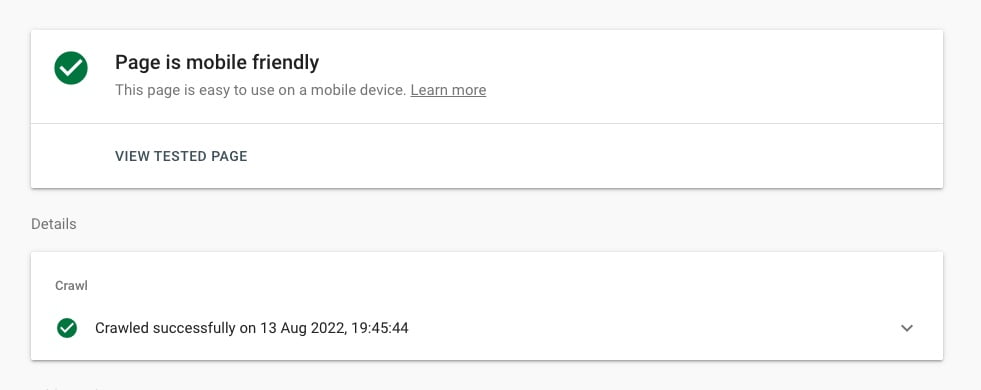
The world’s market leading search engine Google provides a free Mobile-Friendly Test. Just submit your URL (or a code snippet) to get an answer to if your web page is mobile friendly.
Phew! DiviMundo.com passed the Mobile-Friendly Test with flying colors.
That’s all for today!
I hope that you enjoyed this post. Subscribe to DiviMundo on YouTube and join our Facebook group for more crisp content on WordPress and web design.
👉 Related post: How to change the number of columns on mobile in Divi
👉 Related post: Six tips for a better mobile menu in Divi
👉 Free course: Create a website from scratch with Divi


0 Comments